
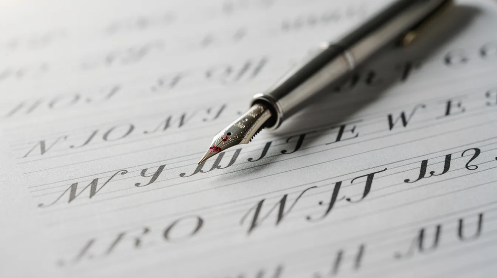
Letter sizing is the thing that separates a page you want to keep from one you turn face-down. Typography involves understanding letter sizing to influence readability and visual hierarchy, and the same is true when you pick up a dip pen. Here is what I have learned, mostly by getting it wrong first.
Why Letter Sizing Matters in My Calligraphy Practice
I scan old brown-ink deeds in a Winnipeg land titles office, and the best clerks’ handwriting stays the same size from the first word to the last. A clear scale in letter sizing guides the reader’s eye across sentences without stumbling. That steadiness came from measurement, not talent. A 1952 calligraphy reference I found specifies that small letters occupy five pen widths, ascenders four, descenders three, and capitals nine.
When I started, I sized by feel. After about three words my wrist relaxed, the angle shifted, and my lines slid uphill. Readability requires proper proportional differences between heading sizes and body text, and the same rule holds inside a single line of calligraphy. Each style has its own ratios, so copy them from the exemplar you are following. Copperplate, Italic, and Spencerian all use different numbers. Read the overview of Spencerian script before you copy its numbers.
Understanding Lowercase Letters
The baseline is where most lowercase letters sit. The waistline marks the top of short letters like a, e, o, and x. The vertical space between those two lines is the x-height, and it is the number everything else hangs on. Ascenders and descenders are measured as multiples of that x-height. A 1:1:1 ratio means three equal zones: ascender, body, descender. Lowercase letters vary in size for better legibility, and those controlled differences create rhythm on the page.
Short Letters
Short letters (a, c, e, i, n, o) live inside the x-height. Narrow forms like i and l are not the same width as m or w, but they should share a consistent body height. When short letters grow too big, a word looks swollen even if each stroke is clean. People tell me their writing looks wobbly when the sizes are the real problem, so fix size first. Kids often write lowercase letters too large initially for the same reason: the hand has not learned where to stop. Teaching lowercase letters in groups improves sizing awareness for any student, child or adult.
Tall Letters
Tall letters (b, d, h, k, l) rise above the waistline. In copperplate, ascender height is often 1.5 times the x-height. I measured x-height carefully for a year and let ascenders wander, so now they get their own guideline. Compare the top of every b and d across one line. If they do not match, your page looks uneven even when the bodies are identical.
Descending Letters
Letters that drop below the baseline (g, p, y, j, q) need a set depth. Uneven descenders collide with the line below. When I practice I leave at least a full ascender plus descender between baselines, which means my line spacing is generous. Sufficient line spacing enhances readability and prevents cramped text appearances in both handwriting and print.
Choosing a Letter Size for My Style
For broad edge work my unit is the nib width. Most foundational exemplars set x-height at four to five nib widths. For pointed pen and brush pens, there is no fixed nib width to measure, so I pick an x-height in millimetres and stick with it. Audience demographics impact font size choices for readability at every scale, so select a size you can control and read back easily.
Matching Nib Size to Letter Size
With a 2.5 mm broad nib and a ratio of four nib widths, x-height becomes 10 mm. Check your own exemplar; do not guess. I use a 5 mm x-height for copperplate and keep one size for a month so I can tell whether I am improving. Pressure changes in pointed pen work make downstrokes thicker, which inflates the perceived size of each letter even when the body height has not moved. I tape a strip of paper with a stair of nib widths to my desk so I can re-check any time. If you are choosing your first nibs, my notes on beginner pens cover the sizes I would start with.
Setting Up Letter Paper
Use letter paper with clear baseline guidelines. Guideline spacing controls height: one row includes ascender zone, x-height, descender zone, and a gap before the next row. Use generous line spacing of about 1.4 to 1.6 times the font size for body text; the same principle applies to line gaps on a practice sheet. I keep a thin strip of card with my heights marked so every line is spaced identically. Graph paper or free printable sheets work if you do not want to draw lines from scratch. Visual boundaries help children size their letters correctly, and they help adults too. Raised line paper aids kids who write letters too big, and raised lines on handwriting paper assist with letter sizing for anyone who cannot feel the baseline. Using a cardboard window cut from a cereal box can define letter size boundaries on a blank sheet. Worksheets with big spaces are ineffective for sizing practice because they remove the constraint that forces consistency.
Letter Paper for Pointed Pen Practice
Smooth paper keeps hairlines controlled. Rough paper catches the nib on upstrokes and makes strokes look heavier and larger. Body text for print should be comfortable for extended reading periods; the same logic applies when choosing a practice sheet you will stare at for twenty minutes. Common reading distance for print materials is about 12 to 18 inches, which is roughly where your practice page sits. Test one word on the paper before committing a full page: check that ink does not bleed and that your lines fit. For finished pieces I put the guideline sheet under good paper on a light pad, so nothing needs erasing.
Understanding Paper Size
Small paper (A5 or postcard) is good for focused drills. Larger paper (A3 or a standard US letter size sheet at 8.5 by 11 inches) reveals drift you miss on small pages. Printed materials often rely on standard sizes to ensure usability and utility, so start with whatever you already have at home. The same sizing logic scales up: a letter height of 3 inches is readable from 60 feet, a 6-inch letter is readable from 150 feet away, and the minimum readable letter size is 6 inches at 198 feet. Recommended letter size for readability on a sign is 20 inches at 198 feet. Letters should be sized based on viewing distance and speed, whether the reader is across a room or across a desk. Larger text helps older audiences or those with visual impairments read easily.
Selecting a Comfortable Practice Format
On a large sheet, divide the page into boxes: half for drills, half for words. Half-page exercises fit short sessions. Once you are happy with isolated letters, turn to full-page practice with sentences. Reuse clean sections of discarded paper for warm-ups. It cuts cost and reduces worry about wasting good stock.
Creating Letter Sizing Guidelines
Draw a baseline with a ruler. Add the waistline at your chosen x-height. Mark ascender height above and descender depth below. Build every guideline from one unit and check each line against it, not against your eye. Using a mathematical scale across sizing units creates cohesive compositions on the page.
Using Slant Guidelines
Add evenly spaced slant lines before you write. Many copperplate sheets use about 55 degrees. Uneven slant makes letters look unevenly sized even when heights match. Erase or ignore the slant lines after practice dries if you find them distracting.
Letter Sizing Exercises for Beginners
Begin with repeated oval drills to calibrate x-height. Then short letters, then tall letters once x-height is steady, and finish with descenders. The drill is dull but it works. I fill a whole line with the letter o or n at the target size before any session. Try more activities beyond drills once your sizing holds.
Isolated Letter Drills
Choose one lowercase letter and write it across a row. Compare the first form with the last. Circle the most consistent one in pencil and record what you changed (posture, pressure, speed) so you enter the next session with a plan.
Word-Level Drills
Select words with repeated letter heights. “Minimum” is a classic because every letter sits at x-height; any size drift is easy to read. Copy each word at one consistent size, compare spacing between differently sized letters, and rewrite the weakest word once. It is not fun at first, but the consistency builds fast.
Fixing Common Letter Sizing Problems
Compare the first and last words on each line. Bigger endings are a sign my hand is relaxing. Smaller endings mean I am tensing near the margin. Speed inflates size, so slow down at difficult transitions. My three checks: a ruler against the waistline, the squint test at arm’s length, and a phone photo, which makes mistakes I had stopped seeing obvious again.
When Letters Become Too Large
Mark oversized letters in light pencil. Rewrite with shorter strokes and less pressure. Compare the corrected copy with the original. If uppercase capitals are swelling, check their ratio against the exemplar; capitals in copperplate often occupy about twice the x-height.
When Letters Become Too Small
Rebuild the x-height with fresh guidelines. Practice larger ovals. Relax the hand on downstrokes. Small writing hides errors from you and exaggerates them to everyone else, so go larger than you think you need. Add space between practice words so each one gets a fair look.
Letter Sizing Across Calligraphy Styles
Copperplate uses a 2:1:2 or 3:2:3 ratio (ascender, x-height, descender) with a slant around 55 degrees. Broad edge scripts measure in nib widths; Italic often uses four, Foundational four to five. Modern brush lettering permits intentional variation, but only when it is consistent. Follow one style per exercise so you can properly size each letter against one set of rules.
The proportional thinking behind calligraphy also governs typography on screen and in print. Letter sizing options generally refer to type scaling across a hierarchy: headings should stand out to establish visual hierarchy in design, while standard body copy size is typically 10pt to 12pt for print or 16px for web. Points (pt) is an absolute unit where 1 pt equals 1/72 of an inch, and pixels (px) is a fixed-size digital unit for screen-based design. Relative units like ems and rems are scaled proportionally to the parent or root font size. Em (em) is a relative unit based on the font size of the parent element, while rem (root em) scales strictly relative to the root HTML element. Percentages (%) are relative sizing tied directly to the parent’s default size. Viewport units (vw and vh) are based on a percentage of the viewport width or height. Mixing relative units with fixed units establishes a clear visual hierarchy. Using rem and vw ensures type scales gracefully across different devices. Relative sizing allows resizing of text in browsers without breaking layout. Standard digital body copy is typically anchored at 16px. Using a contrast ratio of at least 4.5:1 for normal text improves accessibility. Large display headers often look best with tight line height matching the point size. These are equivalent principles: whether you measure in nib widths or in pixels, the logic is the same.
Pointed Pen Letter Sizing
Four to 6 mm is a common starting x-height range for copperplate practice. Keep light pressure on upstrokes so hairlines stay thin. Capitals are often about twice x-height. Flourishing changes perceived size because loops extend past the regular ascender or descender lines. Repeat one exemplar before improvising; learn the standard before you break it. New to the script? Begin with copperplate basics for beginners, which covers the strokes before any sizing work.
Broad Edge Letter Sizing
Nib width sets proportions. A 45-degree pen angle is typical for many broad edge scripts. Changing nib sizes changes the whole alphabet: a 2 mm nib and a 3 mm nib produce different x-heights even at the same ratio. I make a fresh nib-width stair before every line, because a different nib or ink flow shifts the width. I also wrote up what I have learned about inks, since ink flow changes line width too.
Measuring Progress in My Practice
Photograph one practice page each week. Compare x-height consistency in the middle of the page, not just the first line. Track one sizing goal per session: keep ascenders within half a millimetre of the target, or keep every short letter the same size across one word.
A Simple Letter Sizing Checklist
-
Baseline: is it straight across the sheet?
-
X-height: do all short letters reach the waistline?
-
Ascender alignment: do b, d, h, and l match across one line?
-
Descender depth: are g, y, and p consistent across one paragraph?
A Budget-Friendly Letter Sizing Practice Routine
Set aside ten quiet minutes daily. Use inexpensive paper for warm-ups. Reserve smoother paper for finished exercises. Keep one sample page for monthly comparison: write the same word, same nib, same x-height. Cheap setups work when the measuring is solid. Any child or adult can start this way at home with things they already own.
My Suggested Practice Order
-
Warm up with five connected ovals at your target x-height.
-
One row of short letters.
-
One row of tall letters.
-
One short word mixing all heights.
-
Re-measure at the start of every session, because nibs wear, pens change, and paper varies.
Final Letter Sizing Reminders
Consistent proportions matter more than fast writing. Adjust guidelines for each script; do not struggle with one set of lines for every hand. Sizing improves through repetition over days and weeks. After a few months my eye got better at spotting a bad line, but I still keep the ruler for good pieces. If you have a favorite practice method or a letter form that will not behave, I would like to hear about it at [email protected].
FAQ
What size should my letters be when I start? For pointed pen, begin with about a 5 mm x-height on a grid sheet. For broad edge, use the exemplar’s nib-width ratio with a medium nib. If you are working with handwriting skills for kids or younger learners, start big and reduce.
Why do my letters get bigger as I move across the line? The most common answer is a relaxing hand or drifting wrist. Slow down, check posture, and check your paper angle.
Do I need to measure with a ruler every time? Not forever. But keep it for good pieces and warm-ups until your muscle memory is reliable.
Does the size of the nib change the size of my letters? Directly for broad edge, where nib width is the unit. For pointed pen it changes stroke thickness and apparent size rather than body height.
Can I use the same ratios for every style? No. Copy the numbers from the exemplar and write them at the top of your sheet. Copperplate, Italic, and Spencerian each provide different ratios for a reason.