
Three years ago I was scanning old deeds at the land titles office in Winnipeg, the same way I do most days. The documents are written in brown ink that was once black, and most of the handwriting is hurried and plain. But one afternoon I found a page where the clerk had taken real care, and every letter sat at the same angle, every downstroke the same weight. I borrowed a dip pen from a coworker, tried to copy the signature on a sticky note, and produced something that looked like a seismograph reading. I have practiced most evenings since.
If you want the short answer up front: get a pointed pen with an oblique pen holder, smooth paper, guideline sheets with 55 degree slant lines, and spend a few weeks on fundamental strokes before you form any letters. Fifteen to twenty minutes most days is enough. This blog post is the longer answer, with the mistakes I made so you can skip a few. I am not a teacher. My hand is still improving, which is exactly why I remember what confused me.
What Is Copperplate Script, Really?
Copperplate calligraphy originated around 1650 and spread through Europe and North America over the following centuries. The style was named after the engraved copper plates used for printing copybook pages that taught students to write. You will also hear it called English Roundhand, Engrosser’s Script, or simply “round hand,” and the overlapping labels confuse almost everyone at the start. If you want a fuller background, the overview of English round hand is a useful starting point.
It was popularized by calligraphers like George Bickham, whose copybook the Universal Penman gathered samples from twenty five writing masters between 1733 and 1741. The hurried, looser cousins of that script show up on many of the deeds I scan at work, which is what made me want to learn the real thing.
The look is disciplined: copperplate features a strict 55 degree slant in its letters, oval based forms, thin upstrokes created with light pressure and thick downstrokes created by pressing the flexible nib until the tines spread. Copperplate is used for formal writing like wedding invitations and greeting cards, but it started as a practical business hand. Mastering copperplate calligraphy means producing even lowercase and uppercase alphabets with steady slant, spacing and pressure. Compare that with modern calligraphy, which allows playful spacing, mixed slants and personal style much sooner. Copperplate is rule heavy and consistent, not “anything pretty with a brush pen.”
Tools You Actually Need to Learn Copperplate Calligraphy
Copperplate is a form of pointed pen calligraphy, meaning you need a flexible metal nib that spreads under pressure to produce thicker strokes on the way down and hairlines on the way up. Do not agonize over gear. A basic nib and a cheap plastic holder are enough to learn the movement.
Holders. An oblique pen holder helps maintain the 55 degree slant for right handers without twisting the wrist or the paper. A straight holder often suits left handers or people who also practice upright modern calligraphic writing.
Nibs. The Zebra G nib is beginner friendly for calligraphy because it is stiffer, more forgiving, and lasts longer than finer nibs. The Nikko G is a close cousin. Once your strokes feel stable, try a Hunt 101 or Leonardt Principal for a sharper hairline and more responsive flex. Buy a small pack, not a big assortment. My full list of beginner calligraphy pen options is in a separate post.
Ink and paper. Smooth bottled ink like Higgins Eternal or walnut ink (which gives the soft brown I see on old deeds) flows well in a flexible nib. India ink works well with the Zebra G nib, though waterproof formulas can clog finer, more delicate nibs. Keep your ink in a weighted jar that will not tip. Smooth, bleed resistant paper is essential for copperplate practice. Use 32lb or 120gsm paper to prevent ink bleeding. Rhodia pads and laser printer paper both resist feathering. Cheap copy paper and notebook paper bleed and fuzz the hairlines. For more on choosing calligraphy ink, I wrote a separate post.
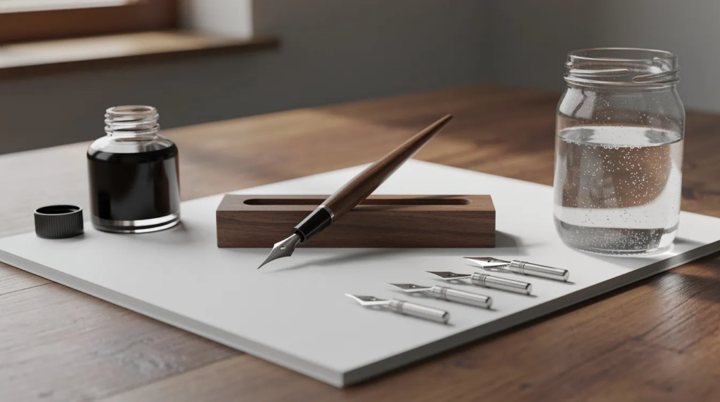
Day one list: oblique holder, one nib, ink, smooth paper, a printed guide sheet, a water jar and a cloth. Add a slanted board and tracing paper later.
Setting Up Your Workspace for Pointed Pen Calligraphy
Sit square to the table with relaxed shoulders. Rotate the paper so your downstrokes naturally follow the 55 degree slant. With an oblique pen, I rotate the paper only slightly. With a straight holder for other scripts, I rotate it more.
If you are left handed, experiment with paper rotation, under or over hand writing positions, and both straight and left hand oblique holders. Several readers have told me they found a comfortable angle within a week of testing.
Good lighting from the side opposite your writing hand keeps shadows off the page. A tense grip slows learning and causes hand fatigue, so check your fingers every few minutes. I keep guide sheets in place with washi tape at the corners, or slide them under translucent paper so I can see the lines without printing on every sheet.
Preparing, Holding and Cleaning the Pointed Pen
A new nib has a thin layer of factory oil that makes ink bead up instead of flowing. This was my first frustration and I nearly decided I had bought a bad pen. Clean it with a damp cloth and a drop of dish soap, or stick the tip briefly in a raw potato, then rinse and dry. A quick flame pass works too, but overheating ruins the temper of the metal.
Seat the nib firmly in the flange, tip centered, slit facing up. Dip only to the vent hole and wipe the excess on the jar rim. I have blotted more practice sheets than I care to admit.
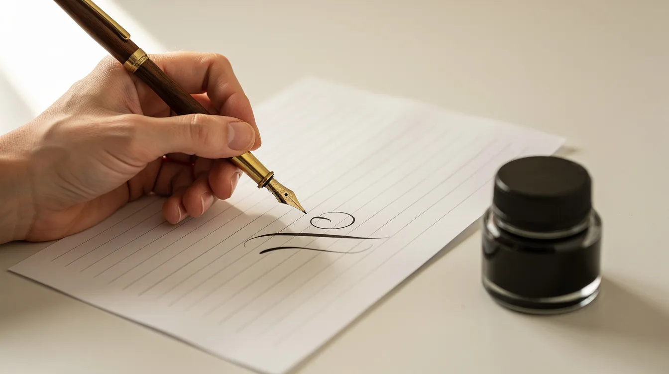
My hold: slightly low on the holder, relaxed finger placement, both tines touching the page, nib pointing toward about one o’clock. Copperplate requires a light grip to prevent hand fatigue. The oblique flange swings the nib into the correct angle relative to the slant line, keeping hairlines centered over shaded strokes.
Cleaning: rinse the nib in water every few lines, wipe gently to avoid bending the tines, and dry completely to prevent rust. Dried ink clogs the slit and ruins flow.
Why Guidelines and Slant Matter in Copperplate Calligraphy
Use a 55 degree slant for copperplate calligraphy. Every downstroke follows that angle, and when they all match, the writing looks uniform instead of leaning like a row of tired trees. My letters did exactly that until I committed to using slanted guidelines for consistent letter formation every single session, even when I felt confident.
The proportion system: the x height is the body of lowercase letters, and ascender and descender lines sit about twice the x height above and below. For example, a 4 mm x height means 8 mm ascenders and 8 mm descenders. A guideline sheet marks the baseline, waistline, headline, ascender line, descender line and repeating diagonals. Practice with printed guidelines helps maintain consistent letter height. You can print free practice sheets or draw your own with a ruler and protractor. I print mine and occasionally share free sheets on Quiet Nib.
Basic Strokes: The Real Secret to Mastering Copperplate Calligraphy
The biggest mindset shift in my first weeks was that I spent them on strokes, not letters. Shaky basic strokes make shaky letters, and no amount of enthusiasm fixes that. Master the basic strokes before attempting full words in copperplate.
The pressure rule works like a heartbeat: press on downstrokes, release on upstrokes. Downstrokes are thick lines made with medium pressure. Upstrokes are thin lines created with light pressure. Thin upstrokes are made by lifting pressure off the nib so the tines close. Never push the nib upward while it is spread, because the tines catch the paper and spatter ink. When I started I pressed on everything and my hairlines were fat and scratchy.
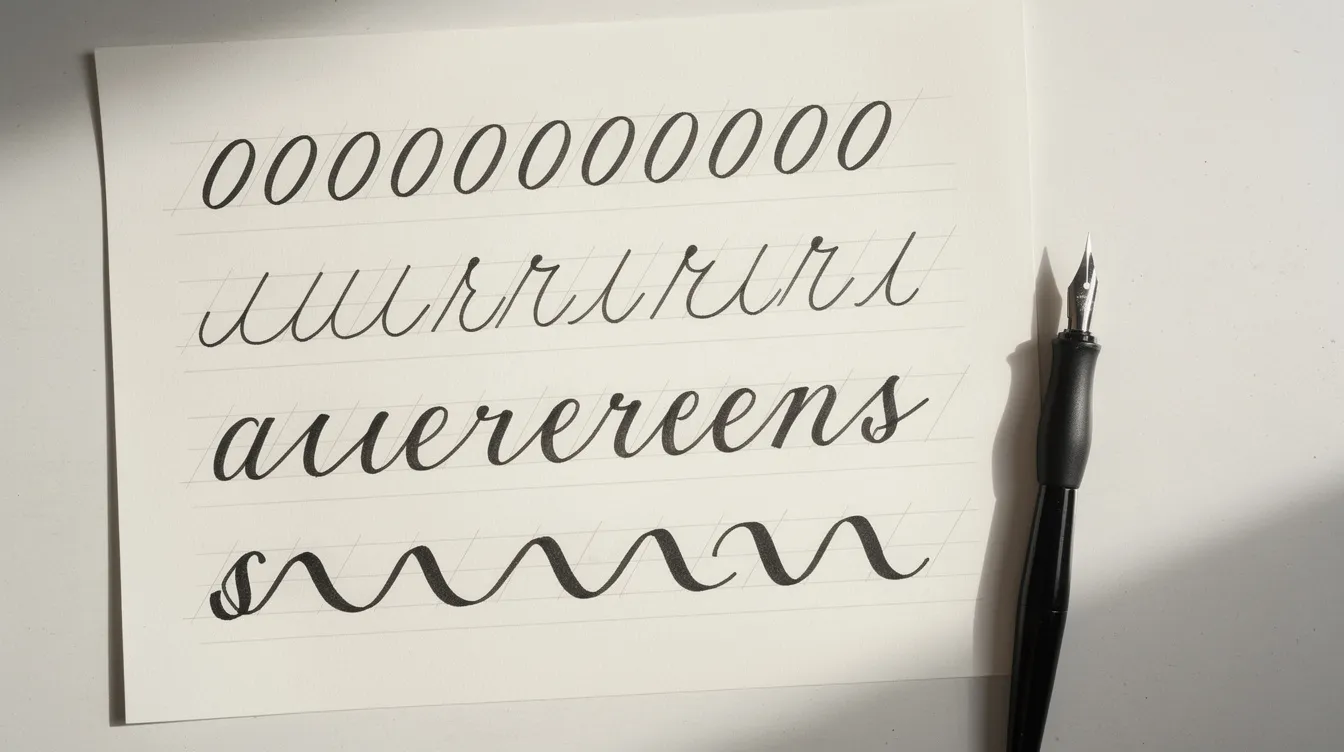
Copperplate calligraphy has 7 basic strokes. Basic strokes include entrance stroke, oval, underturn, and overturn, plus the compound curve, ascending stem loop and descending stem loop. Crossbars, dots and small connectors round out the set. Each one is a building block: every letter in the lowercase alphabet is assembled from these pieces.
How I practice: one stroke per line, slow (about the speed of drawing a line, not signing a card), with deliberate pen lifts and a glance at the slant guideline after every few repetitions. Drills focus on perfecting individual calligraphy elements. Practice drills like ovals build muscle memory for curves in letters. This is learning copperplate calligraphy at its most honest, and daily repetition beats copying inspirational quotes.
From Basic Strokes to Letters: Lowercase Copperplate Script
Group the lowercase alphabet by shared strokes instead of A to Z order:
-
Underturn letters: i, u, w, t
-
Overturn and compound curve letters: n, m, h, r
-
Oval letters: a, d, g, q, o
-
Ascending loops: l, b, k, f
-
Descending loops: j, y, p, z
-
Specials: s, v, x
I started with i and u to focus on spacing, and moved to oval letters only after a full week of oval drills. A letter like a is just an entrance stroke plus an oval plus an exit stroke. A letter like n is an entry hairline plus a compound curve plus an exit stroke.
Maintain equal spacing between letters and strokes. The white space inside a letter should look roughly like the space between letters. Common beginner errors I remember: flat ovals, tilted ovals that break the slant, and descenders crowding neighbors. Try short words early (“minimum,” “banana” or your own name) so you practice connecting strokes while the shapes are fresh.
Uppercase Letters, Flourishes and When to Add Them
Capitals can wait. Trying them too soon was one of my biggest mistakes. Spend several weeks on lowercase first. Uppercase copperplate script letters reuse the same strokes, only larger, with more complex compound curves and extended loops.
I started with three or four capitals from my own name and added new ones slowly. Rushing through the full alphabet in one weekend taught me nothing.
Flourishes were another sign I jumped ahead. They looked beautiful in every tutorial I could watch, but my loops fell apart because my strokes had not settled. Keep flourishes inside an invisible box so they do not crash into neighboring lines, and save them for envelopes and titles, not every letter. Safe beginner shapes are simple ovals and gentle figure eights. Foundations first.
Practice Routines, Free Practice Sheets and Tracking Progress
Consistent practice sessions of 15 to 30 minutes can improve calligraphy skills far more than occasional marathons. My weekday routine: five minutes of warm up ovals and straight downstrokes, ten minutes of one letter family, five minutes writing a short word. Past about 30 minutes my art declined, so I stopped.
Use free practice sheets by following the arrows lightly, then switch to blank guidelines to see what you remember. Practice sheets help beginners learn copperplate effectively because they enforce structure.
Date every page and keep a folder per month. I compared my first drill pages a month later, and it was the quickest way I found to see real progress. My first big jump in control came after roughly three months of short daily sessions, not one marathon afternoon.
Common Copperplate Calligraphy Problems and How I Fixed Them
|
Problem |
Likely cause |
Fix |
|---|---|---|
|
Blobs on downstrokes |
Too much ink on the nib |
Dip only to the vent hole, wipe excess |
|
Skipping or fuzzy hairlines |
Leftover factory oil, dried ink in slit, rough paper, or pressing on upstrokes |
Clean the nib, use smoother 32 lb paper, lighten upstrokes, check both tines touch evenly |
|
Drifting slant |
No guideline sheet, or paper shifted |
Tape a slant guide under every sheet |
|
Ink bleed into fuzzy lines |
Paper too rough or absorbent |
Switch to smooth, heavier paper |
Common beginner mistakes include applying too much pressure and inconsistent slant. I also gripped too tightly. Hold lightly, move the forearm not just the finger, and take a break every 10 to 15 minutes. Another mistake: changing nib, ink and paper all at once so I could not tell what helped. Change one variable at a time.
The mental side matters. Comparing your work to a polished calligrapher who has been at it for a decade stalls progress. I keep a few early sheets visible to remind me how far I have come. Beautiful handwriting developed over time, not overnight.
Copperplate, Modern Calligraphy and Other Pointed Pen Scripts
Copperplate has set stroke order, measured x heights, and even slant on every page. Modern calligraphy trades that depth of structure for personal style sooner. I started with copperplate itself because the guidance is clear: if the slant is wrong, I can see it. In modern work, “wrong” is harder to define, and I wanted constraints while my skill was forming.
Spencerian script is a related pointed pen hand developed in the United States in the mid 1800s. It is lighter and faster, with more delicate ovals and less contrast between thick and thin strokes. The tools overlap, but practicing both at once risks confusion. Pick one style for your first months, one per practice page. The page on Spencerian script on Wikipedia covers its history if you want more detail.
Brush pens are fine for casual lettering and for feeling pressure changes, but they produce a different look. They are not a substitute for a pointed nib if your search is for true copperplate.
Keeping Copperplate Calligraphy Enjoyable for the Long Term
I weave practice into everyday life: writing copperplate headings in my journal, labeling spice jars, addressing birthday envelopes, and copying phrases from the old documents I scan in Winnipeg. Every one of those is a small, real use that keeps the pen in my hand.
Set realistic expectations. Readable letters after a couple of months of regular practice, consistent pages nearer a year, and no finish line. Celebrate small milestones: a first smooth page of ovals, a first word with beautiful contrast between hairlines and shading, a first compliment on an envelope.
Stay inspired cheaply. Historical copybooks are in many libraries, and free tutorials cover every detail you could want. Copperplate has become my slow evening ritual after work: a lamp, a jar of water, a nib and a quiet page. If you have been thinking about starting, pick up the pen today. Not someday.
FAQ
How long does it take to learn copperplate? With 15 to 20 minutes of practice most days, expect noticeably steadier strokes in about three months. Confident, consistent writing takes closer to a year, and there is always more to master.
Do I need an oblique holder? An oblique pen holder helps maintain a 55 degree slant without twisting your wrist. It is not strictly required, but most right handed beginners find it makes the slant more natural. Left handers often prefer a straight holder or a left oblique.
Can I use a brush pen instead? A brush pen teaches you pressure changes, which is useful, but it creates a different style of lettering, not copperplate script. If you want the classic thin hairlines and crisp oval forms, you need a flexible metal nib.
Why does my ink keep blobbing or skipping? Blobs usually mean too much ink on the nib. Dip only to the vent hole and wipe the excess. Skipping often means leftover factory oil, a clogged slit, or paper that is too rough. Clean the nib, check the tines, and try smoother paper.
Should I learn capitals or lowercase first? Lowercase first. Every letter in the lowercase alphabet is built from the same small set of strokes, so you are training your hand with each one. Capitals reuse those strokes at a larger scale, and they make more sense after your fundamentals are solid.