
For most beginners, a bottled black sumi or a smooth, water-based India ink is the answer. I got there by trial and error, mostly with the wrong inks. This post walks through seven families of calligraphy inks, what I actually use at my desk in Winnipeg, and how to choose without filling your cart with bottles you will never finish.
How I Chose These Calligraphy Inks
When I started, I borrowed a dip pen from a coworker, filled it with whatever black was in my junk drawer, and got feathering, skipping and blobs. The nib was fine. The ink was the problem. I had assumed ink was ink, even though I literally scan century-old brown deeds at my land titles job and should have known better.
I am a hobbyist who practices most evenings and pays for my own supplies, so I am picky about value. I am not sponsored, and I leave out rare brands so this list stays realistic for readers in Canada, the US and Europe in 2026. The focus is bottled inks and mixes that work with dip pens, pointed and broad edge, for practice and simple home projects.
Before you add anything to your mind or your shopping list, here are the criteria that actually matter.
Evaluation criteria that actually matter when choosing ink
-
Nib performance. Good calligraphy inks should have a uniform consistency and smooth flow. The ink has to cling to the metal, release smoothly and dry without bleeding. High-quality dip inks cling well to metal nibs and release smoothly to avoid blots. Dip inks are intentionally thicker than fountain pen inks for better control. This balance separates a good calligraphy ink from a bottle that is merely black.
-
Paper behavior. The same ink can look wonderful on one sheet and awful on another, so try a different paper before throwing a bottle out. Testing ink on paper before use is highly recommended. Lightweight paper tends to bleed more than heavier paper.
-
Opacity and colour. Whether fine hairlines stay the same colour as downstrokes, and how the ink shows on white vs kraft vs black paper. Carbon and pigment inks offer complete opacity on paper.
-
Drying time and smudge resistance. How long I actually wait before touching envelopes, journal pages and practice sheets.
-
Archival qualities. Pigmented acrylics and iron gall inks resist fading under UV light. Dye-based inks tend to have lower water resistance and less lightfastness than pigment inks. For lasting artwork, look for inks specifying lightfastness and archival quality.
-
Ease of use. How forgiving the ink is for beginners and whether it needs gum arabic or dilution.
-
Availability and price. Rough 2026 price ranges and whether big online art shops usually stock it.
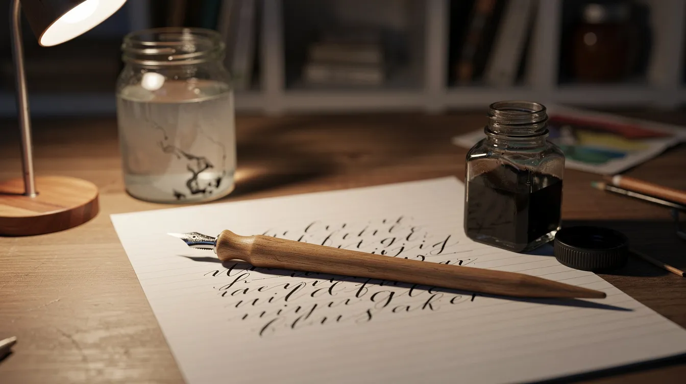
Inks vary greatly in binders, pigments and flow characteristics affecting letter quality. Choosing the right ink for calligraphy depends on the tool and project goals. My ten-minute test for any new bottle: clean the factory oil off the nib, dip just past the vent hole, tap off the excess, draw upstrokes, downstrokes and ovals, write a real sentence, check the edges for fuzz, then touch a corner once dry to check for smearing.
Best 7 Types of Ink for Calligraphy Beginners
Seven options cover the main families: everyday black, waterproof black, brown/vintage, metallics, white, fountain pen style dye inks, and gouache mixes. Each is a representative type with one brand example and close alternatives, ranked by usefulness for beginners.
1. Everyday Black Sumi Ink (e.g. Moon Palace Sumi)
Sumi is my workhorse black for practice and finished quotes, and Moon Palace Sumi Ink is the bottle I reach for most often. It is my one-bottle answer for beginners.
Sumi ink dries completely opaque on fine hairlines and downstrokes alike. Moon Palace Sumi Ink dries completely opaque on thin upstrokes. It is excellent for expressive brush strokes and traditional East Asian calligraphy as well as modern calligraphy scripts. Sumi ink is not prone to bleeding on various paper types, making it forgiving on budget copy paper. A few drops of water revive it if it thickens. The deep matte black scans and photographs clearly for sharing work online.
Some formulations smell a bit noticeable at the desk. It is not fully waterproof on every paper, so I would not use it for wedding envelopes in a rainy season. Wipe the nib every few lines and rinse regularly because it dries fast on the metal.
2. Waterproof Black Acrylic Ink (e.g. Ziller or Dr. Ph. Martin’s Black Star)
Acrylic black is a step up when you want calligraphy that will endure spills, sun and scanning. Acrylic-based inks dry completely waterproof and sit crisply on paper fibers. Ziller Inks are waterproof and lightfast, drying opaque and brilliant, and Ziller Inks come in over 30 colours. Professional calligraphers often seek inks with archival quality for commissions, and this family delivers. India ink consists of fine carbon black particles suspended in water, and some waterproof varieties add shellac as a binder. Never put shellac-based or waterproof drawing ink in a fountain pen, because it clogs the feed. For background on the ink itself, see the Wikipedia entry on India ink.
These inks dry on the nib quickly, so rinse often and work from a small inkwell. They stain clothing and desks, and cost a bit more than basic sumi.
3. Walnut Ink (Liquid or Crystals)
Walnut ink is my favourite for vintage browns. Walnut ink produces a warm sepia tone ideal for vintage-style lettering that dries lighter at the edges, like the real nineteenth-century documents I scan at work. I should mention that iron gall ink has been used since the Middle Ages for manuscripts and is the historical ink behind most of those brown signatures. Iron gall inks are acidic and can eat old paper and be harsh on nibs, so walnut is the safer, friendlier alternative for practice. The iron gall ink page covers how those historic recipes were made.
It is smooth on the nib for clean copperplate hairlines, and crystals travel well in a pencil case. However, walnut ink is watery and suits larger letters better than tiny tight scripts. It is not waterproof, and colour varies with the mix, so keep test swatches with ratios noted. If you want to try the script those documents were written in, my copperplate lettering basics post is the next read.
4. Metallic Pan Colours (e.g. Finetec / Coliro) Used as Ink
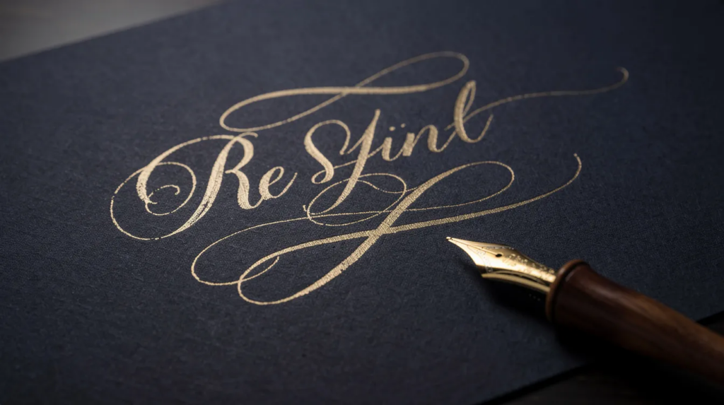
Technically metallic watercolours, but activated with water they behave like luxurious metallic inks. Finetec Metallic Watercolours offer over 20 shades of metallics, including gold, silver and jewel tones that really show on dark envelopes and black sketchbooks. No bottle to spill in a bag.
They are highly opaque on black paper once mixed to the right consistency and can be fed to the nib with a brush or dropper. A pan lasts a long time because each session uses so little paint. However, heavy mica settles on the nib and thickens hairlines if the mix is too dense, and they cost more than a bottle of black, so treat metallics as a “treat” ink, not a daily workhorse. You can create holiday cards, place cards and gift tags that elevate simple writing into something people save.
5. Opaque White Ink (e.g. Dr. Ph. Martin’s Bleed Proof White)
White inks are the key for kraft, navy and black paper, and for small corrections. Dr. Ph. Martin’s Bleed Proof White is a highly concentrated paste you dilute to the exact opacity you want, giving crisp hairlines that stay truly white on dark paper. Dr. Ph. Martin’s Bleed Proof White lasts a long time when mixed, so a single jar stretches across many sessions. It can be tinted with watercolour or gouache for pastels and works across nibs once the water ratio is dialed in.
Too much water is streaky, too little is chunky. It skins over if left open, but a few drops of water and a stir fix it. It can flake on very absorbent paper if flexed hard.
6. Fountain Pen Dye Inks Used with Dip Pens
I sometimes borrow a favourite fountain pen ink, like a bright turquoise or a sheening burgundy called something like Blue Pumpkin, for dip pen sessions. I tried it early and results were mixed, so it is an experiment for after the basics. Dr. Ph. Martin’s inks come in leak-proof eye dropper bottles and offer a vast range of colours, including shading and sheening effects that look magical in larger letterforms. Many readers already own a bottle, making it a free way to discover colour.
Fountain pen inks should be specifically designed to avoid clogging a pen’s feed, which means they run thin on a dip nib, need frequent dips and feather on cheap printer paper. They are not archival and colours can fade in sunlight. Only this direction is safe: fountain pen ink does not belong loaded into other inks’ territory, and dip pen inks do not belong in fountain pens.
7. Designer Gouache Mixed into Custom Calligraphy Ink
Gouache is my go-to for a specific colour bottled inks do not offer, like a particular olive green or muted rose. Gouache can be mixed for specific colors in calligraphy. Mix it with water to the consistency of cream and load the nib with a small brush. Gouache can be mixed with water for desired opacity and consistency, and it adapts to light-on-dark work because it is already opaque. Practice in black first, because colour hides far fewer mistakes.
It revives with water after drying on palettes, works with pointed and broad nibs, and reuses supplies from watercolour or illustration hobbies. It needs careful balance of water and sometimes gum arabic to avoid cracking or chalky strokes, takes longer to prepare than a bottle, and cheap brands may not be lightfast, so check pigment information for displayed pieces.
Quick Comparison of the Best Ink Types for Calligraphy
If you are skimming on your phone, here is the short version:
|
Ink Type |
Best For |
|---|---|
|
Everyday Black Sumi |
Nightly practice and all-purpose black on white paper |
|
Waterproof Black Acrylic |
Framed pieces, outdoor envelopes, water or sunlight concerns |
|
Walnut Ink |
Vintage-style scripts, journaling and sketchbook play |
|
Metallic Pan Colours |
Shimmer on dark envelopes, gift tags and festive projects |
|
Opaque White Ink |
Kraft, navy and black paper or small highlights |
|
Fountain Pen Dye Inks |
Colourful headings and soft, translucent journal calligraphy |
|
Gouache Mixes |
Custom colour matching when no bottle offers the exact shade |
How to Choose the Right Ink for Your Calligraphy
There is no single “best” ink, only the best match for how and where you practice.
Paper and projects. Smooth watercolor paper works best for calligraphy inks. Cheap printer paper behaves very differently from Rhodia pads or heavier stock, which matters for watery vs thick inks. For example, mailed envelopes, sketchbooks, bullet journals and framed quotes on cold-press watercolour each suggest different tools. Start with sumi on smoother paper, then branch out. Common fixes from my own mistakes: thin gloopy ink with a few drops of distilled water, dip no deeper than needed and never let ink dry on the nib. Once the ink flows well, getting letter sizing right is the next thing I would tackle.
Durability. Quick practice can use non-archival inks. A finished piece headed for a wall or a wedding calls for waterproof, lightfast options. Casual journals closed on a shelf worry less about fading.
Experience. Beginners should pick one forgiving bottle, like Moon Palace Sumi, for the first few months. I learned more from one or two reliable inks than from the shelf of unknowns I bought early on. Gouache and metallic tinkering is more fun once basic strokes feel comfortable. My own progression: one black for months, then walnut, metallics and white. That step-by-step approach suggests patience is worth more than a big collection on day one. Keep in mind that ink and nib work as a pair, so choosing the right pen matters too. If you are still choosing a holder and nib, see which pens to start with.
Which Ink Is Best for You Right Now?
You do not need every ink on this list to make beautiful letters. Choose everyday black sumi if you are just starting and practice often. Choose waterproof black acrylic if you make finished pieces and care about water and light resistance. Choose walnut ink for old-document ideas and relaxed sketchbook sessions. Choose metallic pans or opaque white for dark envelopes and holiday pieces. Choose fountain pen inks or gouache mixes if you enjoy colour experiments and already have other inks at home. The rest can wait.
Final Thoughts
The best ink is the one that lets you sit down and practice without fighting your tools. One small bottle of sumi, smooth paper and a few weeks of practice is enough to find whether this art sticks. I was content with one bottle for a long time, and honestly, making the writing better matters more than making the ink collection bigger. Once your strokes feel steady, my post on sizing letters evenly is the next thing I would read.
On Quiet Nib I plan to keep sharing pages from my practice pads and test sheets so readers can see how inks behave in real life, not just in marketing photos.
FAQ
What is the best ink for calligraphy beginners? Bottled sumi ink is my pick because it flows well, stays opaque and does not depend on mixing. A good water-based India ink is a close second.
Can I use regular fountain pen ink with a dip pen? Yes, but it often runs thin and may not cling to the nib well enough for crisp strokes. It is fine for experimenting, not for polished work.
Why is my ink feathering or bleeding? Usually the paper is too absorbent or there is too much ink on the nib. Switching to heavier, smoother paper is almost impossible to regret and will affect your results immediately.
Is waterproof ink better for calligraphy? Only if you plan to paint or wash over the work, or if the piece will face water or Windsor weather. Waterproof ink dries on the nib fast and needs prompt rinsing, so it is not ideal for relaxed practice.
How do I thin ink that is too thick? Add a few drops of clean water at a time, stir gently and test on scrap paper until you find the right consistency. Today, that is still the simplest fix I know.